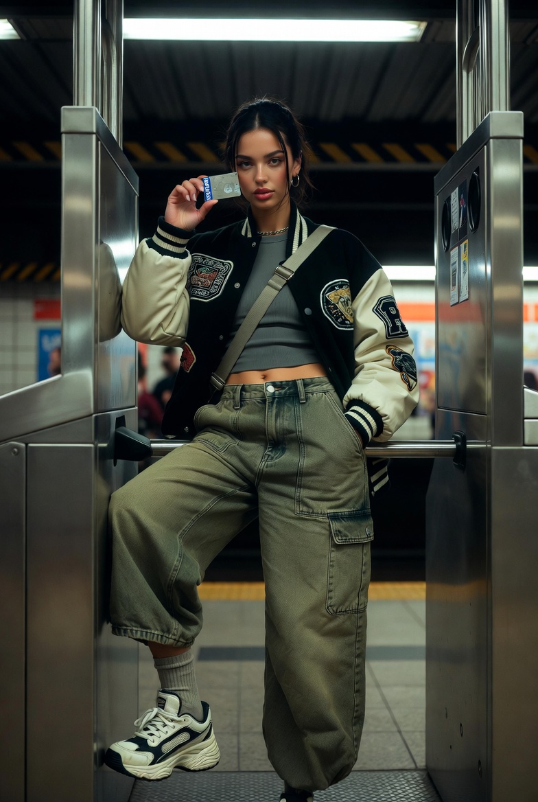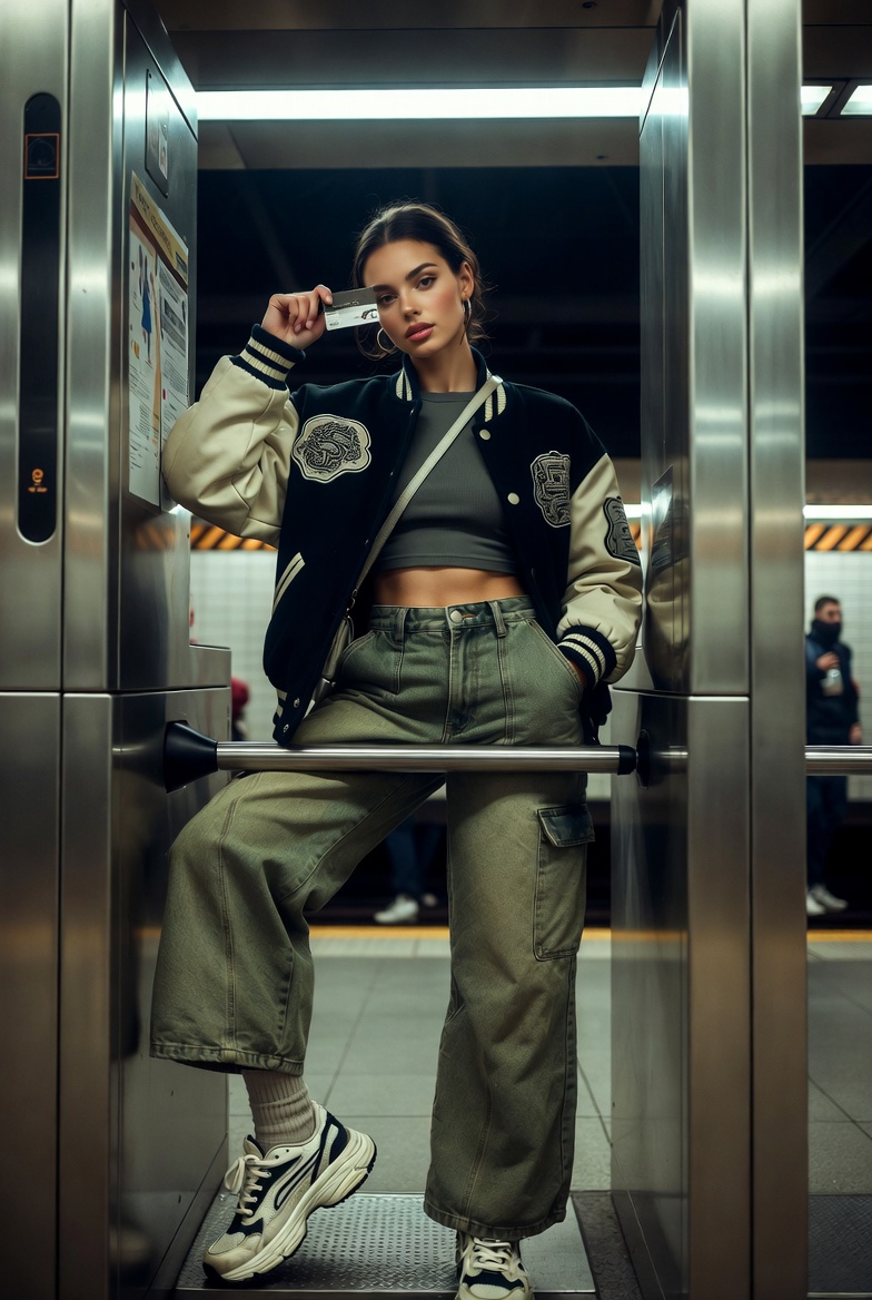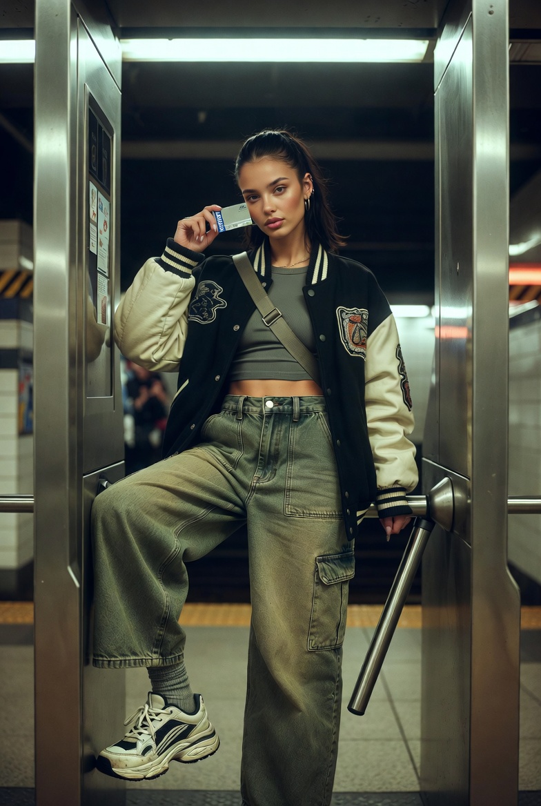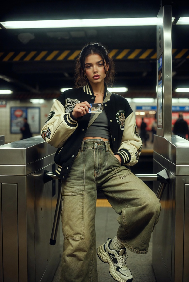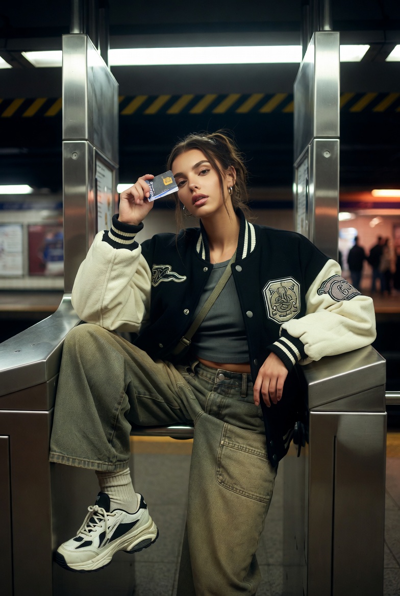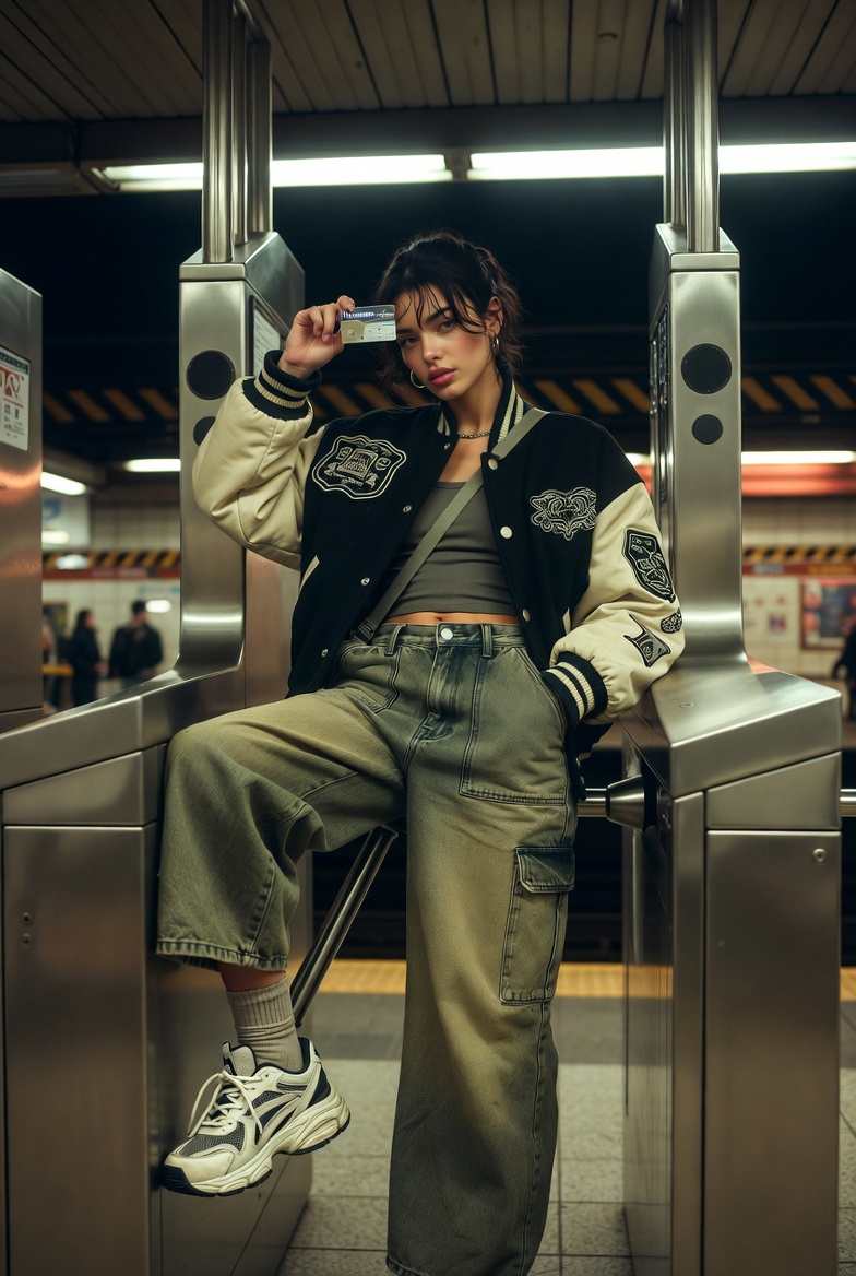
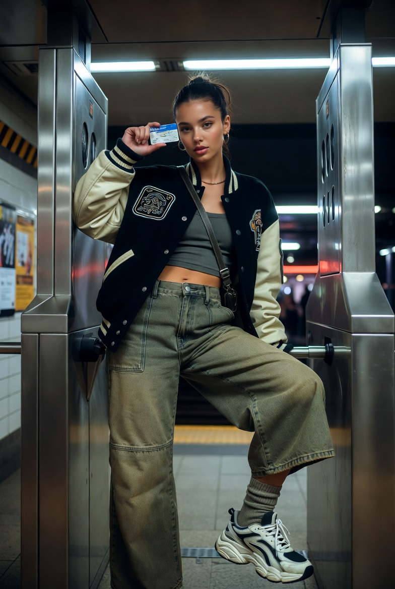
Some urban images feel viral because they’re polished; this one hits because it’s alive. A subway station is all texture and story brushed steel turnstiles, chipped tile, warning stripes, posters layered like collage, and that unmistakable mix of fluorescent light and underground shadow. It’s a place where fashion looks tougher, more real, and more “caught in the moment,” especially when the subject isn’t posing like a studio model but owning the environment with casual confidence.
In this scene, a stunning young woman (early 20s) leans against a turnstile with a rebellious, don’t-care energy that still reads stylish and intentional. She’s not vandalizing anything or doing something extreme; it’s the attitude that’s edgy one hip against the metal arm, one sneaker toe hooked lightly on the base rail, shoulders relaxed like she’s waiting for a friend and knows the camera is there. She holds a metro card between two fingers, wrist loose, as if she’s about to tap through then she glances back at the lens with a half-smile that says, “Yeah, I’m late. No, I’m not stressed.”
The outfit is pure modern streetwear structured enough to photograph sharply, comfortable enough to make sense underground. A slightly oversized varsity jacket is the hero: bold patches, ribbed cuffs, and that matte-wool texture that looks expensive under harsh station lighting. Underneath, a fitted cropped tank keeps the silhouette clean without overcomplicating the frame. Instead of repeating the usual mini skirt trope, she wears high-waisted wide-leg cargo pants with crisp stitching, roomy pockets, and realistic creases at the knees giving the look movement and authenticity. Chunky sneakers ground the styling (and the scene), while small details sell the realism: a crossbody bag strap across her torso, a simple chain necklace catching tiny highlights, and a glossy manicure that pops against the metro card.
The composition pushes this into “movie still” territory. A subtle Dutch angle adds kinetic energy perfect for a station where everything is lines, arrows, and motion while the background becomes a soft blur of commuters and signage. The lighting is intentionally mixed: cool overhead fluorescents plus warmer platform spill in the distance. That contrast makes skin look dimensional, keeps metal reflections believable, and turns the station into atmosphere instead of clutter. The final mood is gritty but stylish, candid but editorial exactly the kind of street photo that looks accidental and ends up being the one everyone shares.
The Master Prompt
Why This Prompt Works
The 24mm perspective captures the environment (turnstile geometry, signage vibes, station depth) without losing intimacy especially when you keep the subject close to center frame. The Dutch angle injects movement and attitude, turning straight station lines into visual energy that matches the rebellious streetwear mood. Mixed lighting is the secret sauce: cool fluorescents sharpen textures (metal grain, fabric weave), while warmer distance glow keeps skin from looking flat or clinical. With Kodak Portra 400 styling, skin tones stay believable and creamy even under harsh overhead lights, and the scene maintains a filmic grit instead of a sterile digital look.
Style Variations
- More punk edge: Swap the varsity jacket for a cropped leather jacket (matte, not glossy), add a band tee, and switch cargo pants to ripped black jeans with heavier boot styling.
- Clean “city minimal” streetwear: Use a long black trench over a white tank, tailored wide-leg trousers, and sleek sneakers keep the Dutch angle but reduce background motion for a calmer frame.
- Night neon station: Push the time later, add subtle magenta/cyan ad-panel glow in the background, and increase reflections on the turnstiles for a more cinematic cyber-city vibe.
Common Issues & Fixes
- Turnstile arms warp or duplicate: Add “accurate turnstile geometry, consistent bar spacing, straight metal lines, correct perspective.”
- Hands look wrong holding the card: Include “natural finger curl, correct thumb placement, realistic grip tension, proper card scale.”
- Station signage turns into unreadable clutter: Ask for “simple abstract signage shapes, no tiny legible text required, background softly blurred.”
FAQ
Q1: How do I make it feel more candid (like a street photographer caught it)?
Add “slight handheld framing, imperfect crop, micro-motion in hair and jacket hem,” while keeping eyes sharp.
Q2: What if I want less distortion from the wide lens?
Switch to a 35mm look and step back slightly keep the Dutch angle and turnstile framing for energy.
Q3: How do I keep fluorescent lighting from making skin look sickly?
Include “Portra-style warm skin balance, gentle neutral fill on face, controlled green cast” so tones stay natural.